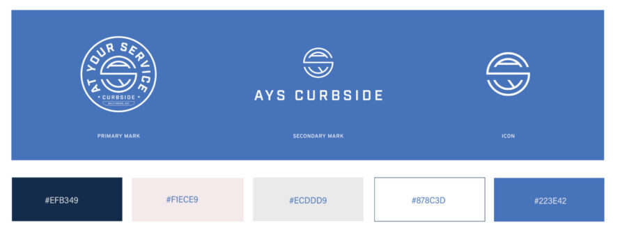
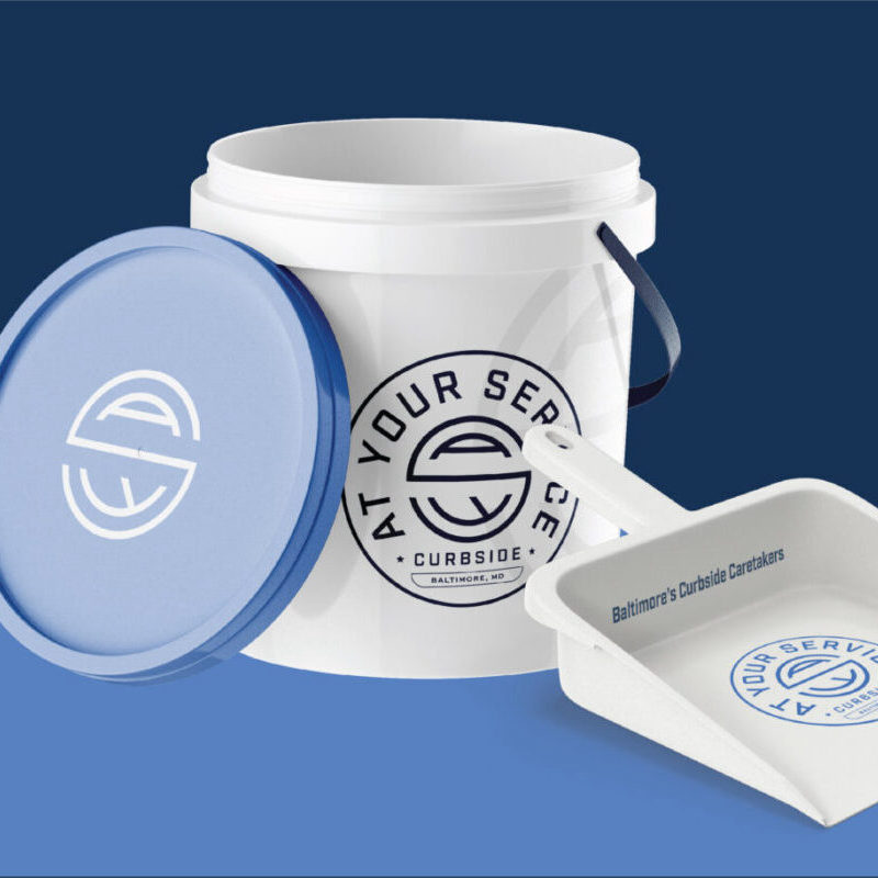
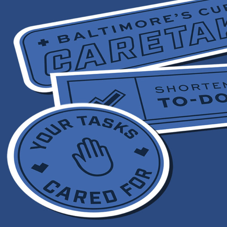
The first crucial step was to define a brand identity that would stick out in consumers’ minds and adequately communicate their services as a business. Our graphic design team workshopped different logo designs, eventually landing on a badge-inspired logo that suggests professionalism and expertise. It is effective at a distance, as it’s easily identifiable, but it also brings together subtler design details the longer you look. For the color palette, we made a clear, loud blue the center color for the design. It immediately captures the eye and feels perfectly appropriate for their curbside cleaning business.
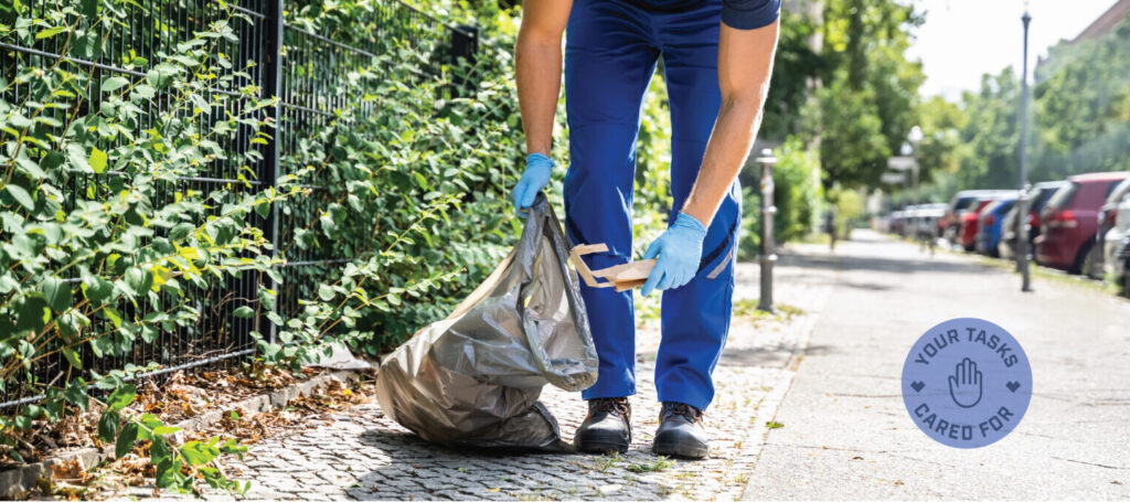
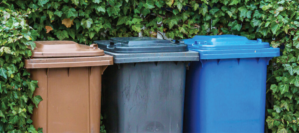
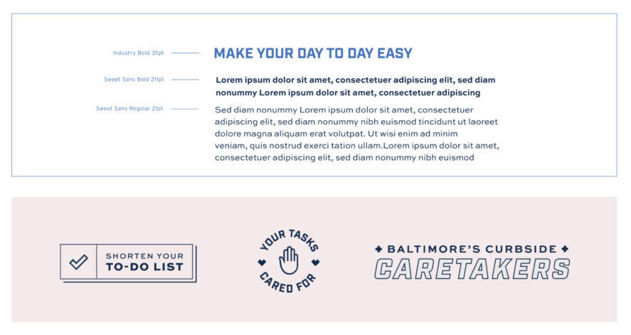
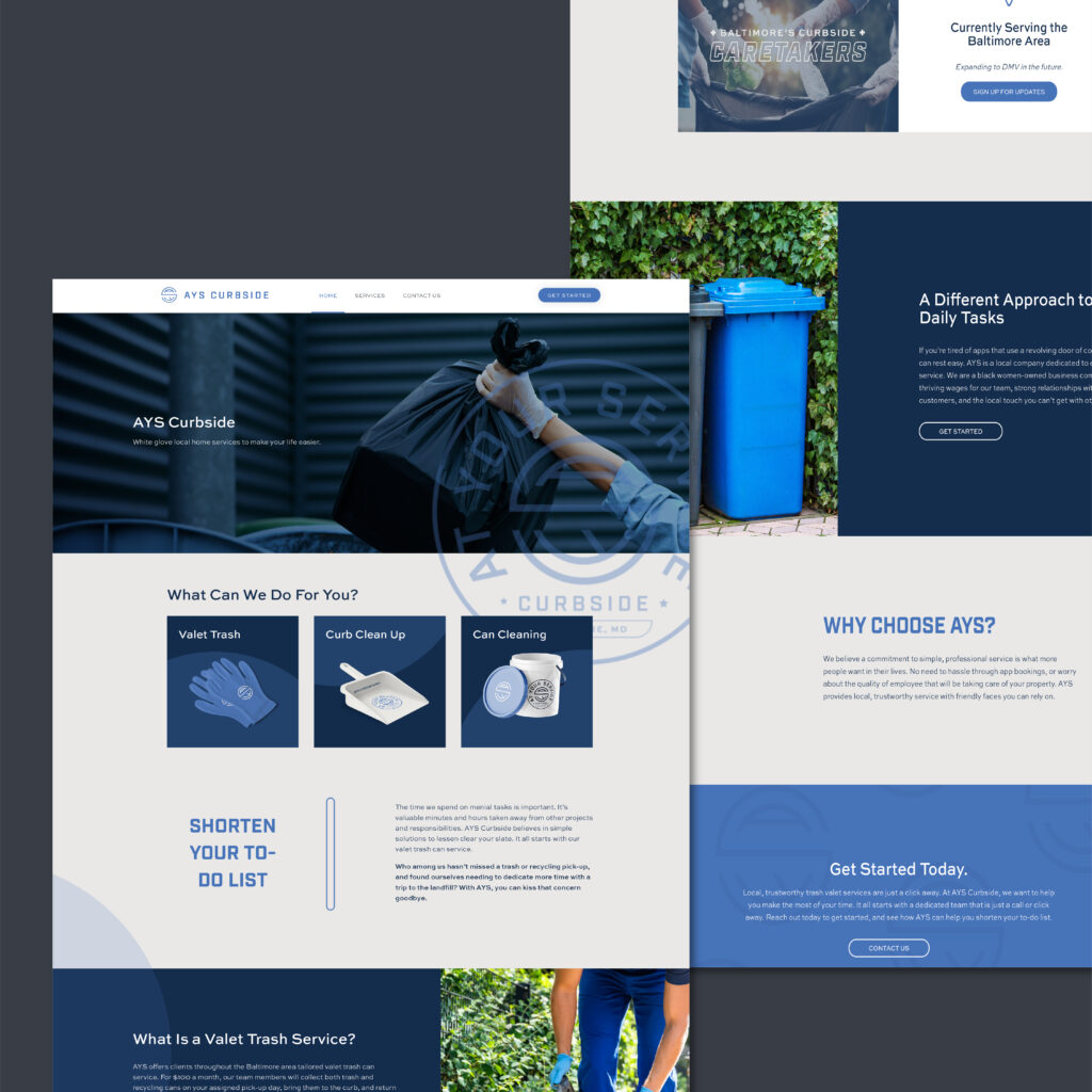
With the branding in place, we moved forward with a website build. We wanted to create something straightforward, practical, and human. One part of the process was curating stock photography that captured the company’s identity. The logo design was repurposed creatively throughout the pages to lend some texture and complexity to areas that might otherwise have felt too simple. For a copy, we worked with the clients to create a brand voice that was clear, concise, and professional. Our team workshopped several slogans until we found one that encapsulated the offered service and the expectations clients can bring to the table. Each page was optimized with SEO-forward writing to help create a local customer base more quickly.